Pooja Gawande
Case Study
Peek at Menu
Overview
Project Type: Personal UX/UI Design Project
Role: UX Designer (Research, Ideation, Wireframing, UI Design, Prototyping, Testing)
Tools: Figma, Figjam, Google Forms
Timeline: 4 Weeks
Platform: Web Application
The Problem
Post-pandemic, dine-in restaurants were moving toward contactless experiences. However, many QR-based menus are clunky, difficult to navigate, or simply PDF scans.
User mainly struggles with:
- Users prefer contactless digital menus to avoid touching shared surfaces
- Unreadable PDF menus on smaller screens
- Confusing navigation and poor categorization
- Inconsistent visual hierarchy
- No personalization or interactivity
The Goal
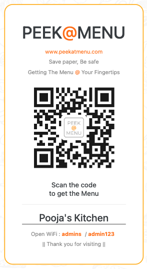
To design a seamless, contactless dine-in experience that begins the moment a guest scans a QR code.
“Come Over. Scan.”
The idea is simple. Customers arrive, scan the QR, and get a clean, fast, personalized menu experience without downloading an app.
Target Users
- Dine-in restaurant customers
- Restaurant staff (indirect users)
- Small to medium-sized food businesses wanting a better digital menu system
Research
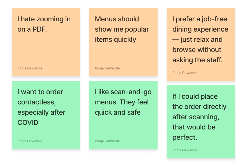
Conducted 6 quick interviews with restaurant-goers (ages 22–45) to understand their experiences with QR-code-based digital menus.
These insights guided the design direction for Peek@Menu, emphasizing speed, clarity, accessibility, and a fully contactless experience.
UX Strategy
User Journey
-
01
Scan QR
The customer scans a unique QR code placed on the restaurant table using their smartphone camera.
No app download needed — just scan and go. -
02
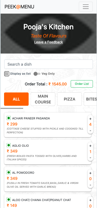
Land on digital menu
The menu opens instantly in the mobile browser. It is optimized for speed, readability, and ease of navigation.
Fast loading, no sign-up, no pop-ups. -
03
Browse by categories or filters
Customers can explore items grouped under categories like "Starters," "Mains," "Desserts,".
User can filter based on preferences or restrictions quickly. -
04
Select items to order
Tapping on an item shows a clean detail view with a description, icons (e.g., spicy, vegan), price, and an “Add to Order” button.
Visual cues and simple UI help users make quick decisions. -
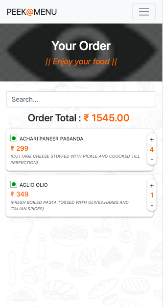
05
Place order
After finalizing selections, users can review their virtual tray and either:
- Place the order directly (if enabled), or
- Share their tray summary with the waiter for final confirmation.
Streamlined, contactless, and efficient.
User Personas
Persona 1: Rachel | Health Conscious Diner
- Age: 28 | Occupation: Marketing Executive
- Needs: Contactless, mobile-friendly menu access
- Goals: Assurance that the restaurant cares about hygiene
- Frustrations: Handling physical menus shared by multiple customers
Persona 2: Karan | On-the-Go Foodie
- Age: 40 | Occupation: Sales Executive
- Needs: Smooth browsing experience with minimal taps or zooming
- Goals: Quickly browse menu options while on the move
- Frustrations: PDF menus that don’t scale well on mobile screens
- Age: 40 | Occupation: Sales Executive
- Needs: Smooth browsing experience with minimal taps or zooming
- Goals: Quickly browse menu options while on the move
- Frustrations: PDF menus that don’t scale well on mobile screens
UI Design
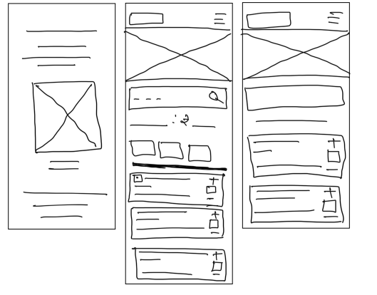
Design Process
To bring structure and clarity to the user interface, I followed a two-step approach: starting with low-fidelity wireframes and evolving them into high-fidelity mockups.
From Low-Fidelity to High-Fidelity